
OLIVEIRA
Design of the website of
Inés Oliveira, interior designer
INTERIOR DESIGNER
Role: Frontend Designer
Project Type: Decor, Web, Product
Tools & Methods: Figma, VSC
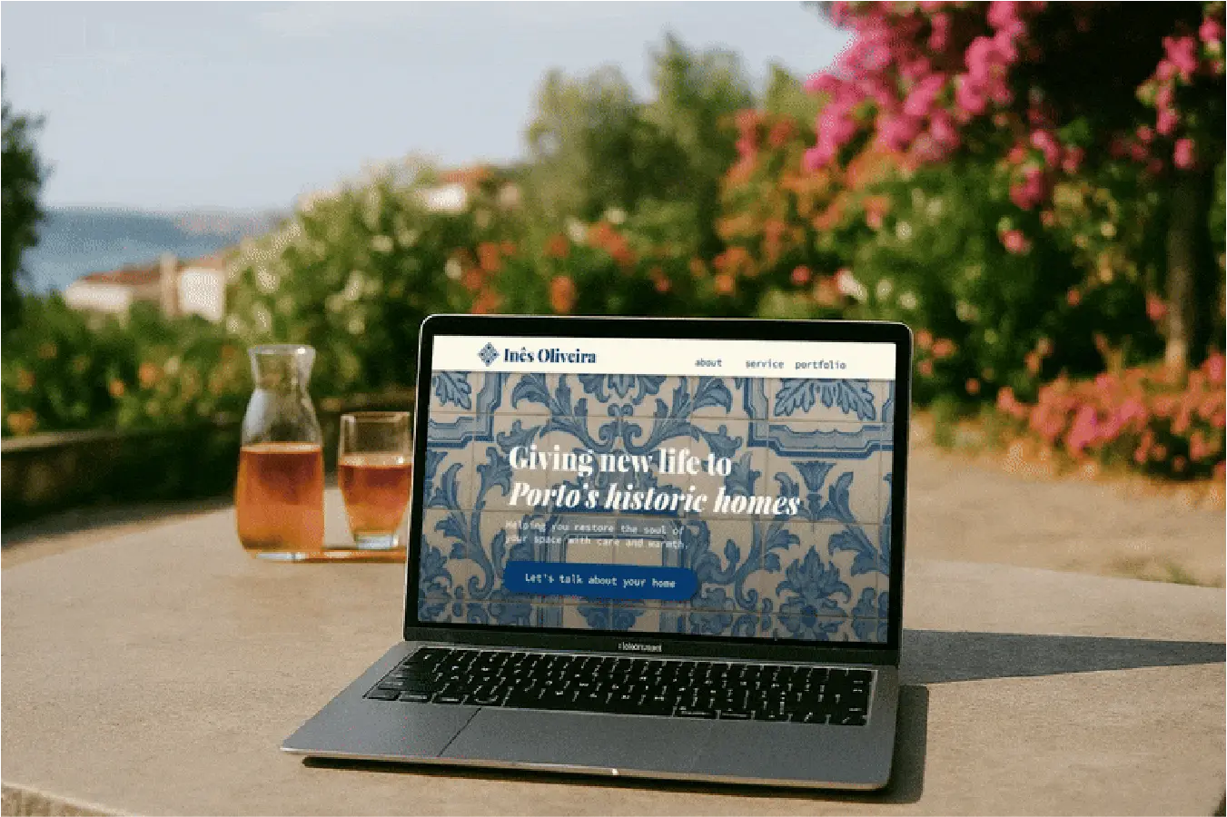
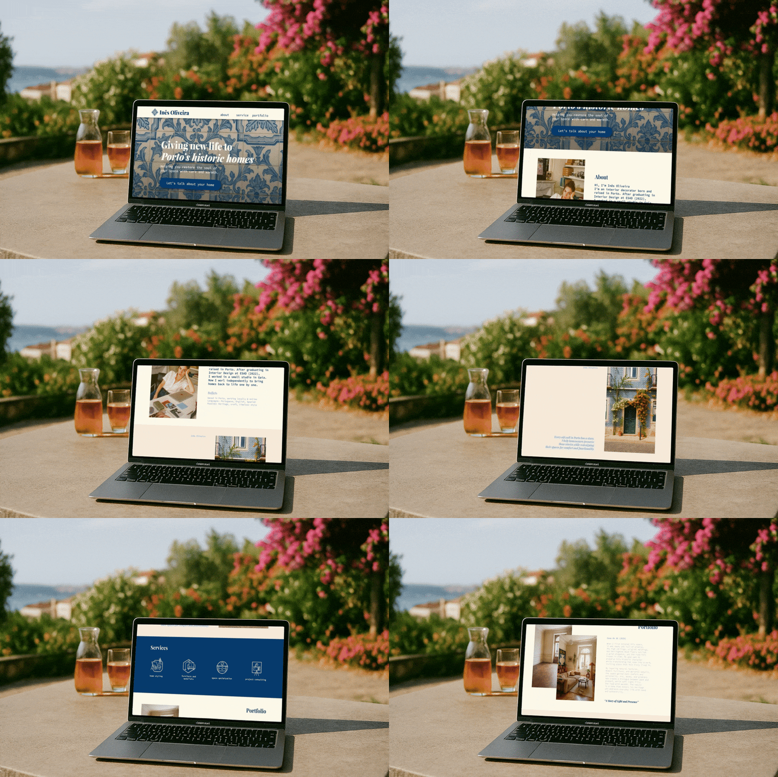
A one-page site that looks like Porto and feels like Inês — personal, warm, and rooted in heritage. It proves that even the simplest structure can carry depth, storytelling, and cultural identity. And yes, the iconic tiles are very much included.
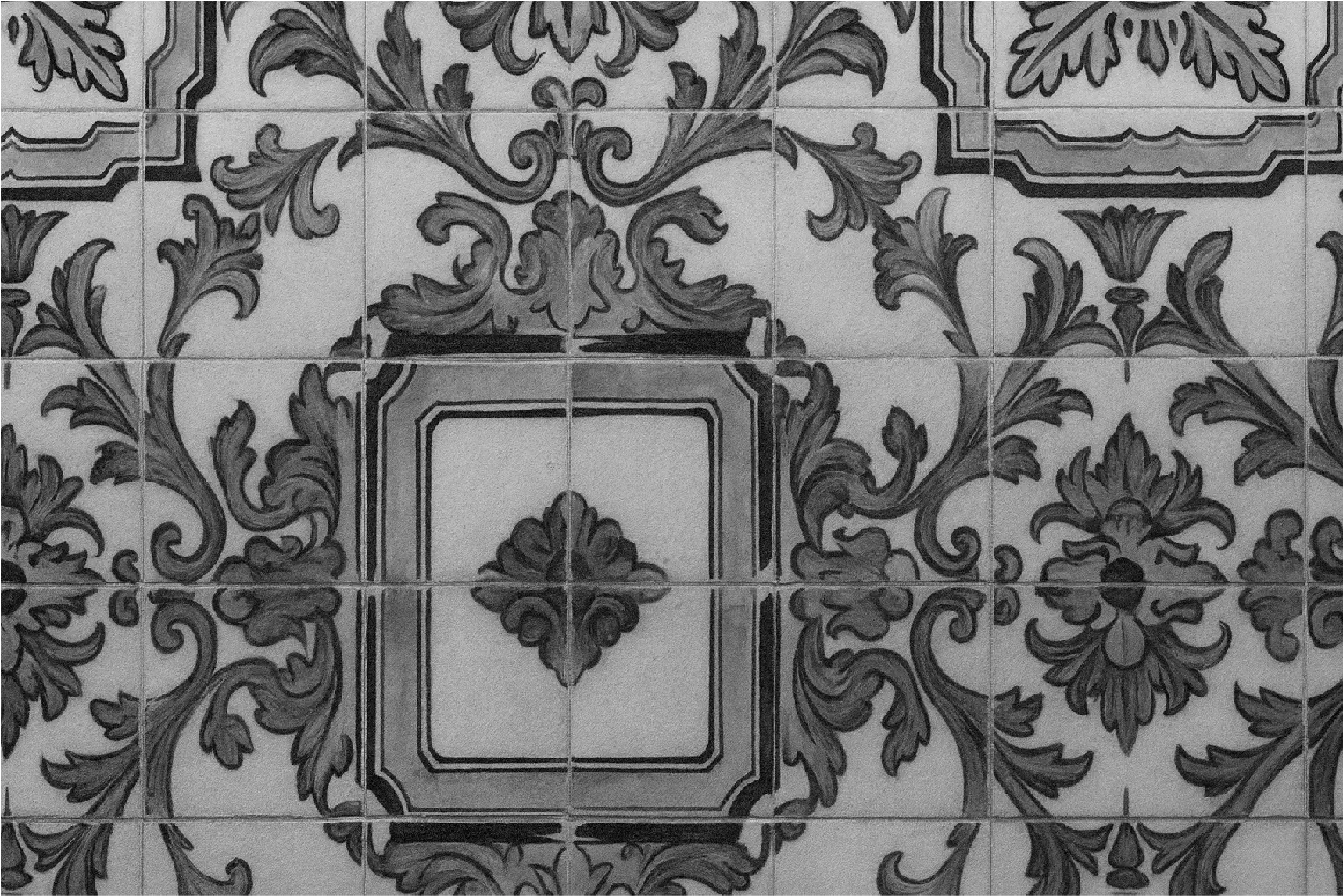
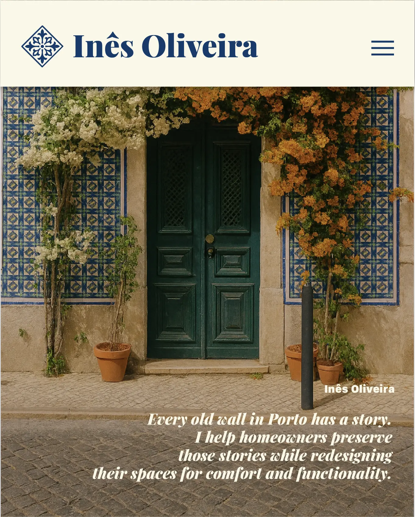
As the frontend designer behind this project, my goal was to translate the essence of Porto and the personality of Inês Oliveira into a one-page website that feels cultural, modern, and human at the same time. The design began by anchoring everything in a tile-inspired visual direction, using a hero built on deep Porto blue (#183A69) layered over high-quality azulejo photography. From there, I created a warm and welcoming visual system using a soft ceramic off-white (#FAF7E9) as the main background tone, ensuring every element felt comfortable and intentional. The secondary blues (#82AFDB and #2DCCC3/3DCCC3) allowed subtle accents that added depth without overwhelming the layout. Structurally, I focused on clarity and smooth flow: hero, story, about, services, portfolio, testimonials, and contact — all designed for intuitive scanning and fast comprehension. The typography, spacing, and interactions were crafted to feel modern but with a softness that matches Inês’ brand. My approach prioritized emotional storytelling without sacrificing frontend cleanliness or usability.
COLOR PALETTE
#183a69
#faf7e9
#82afdb
#2dcccb3



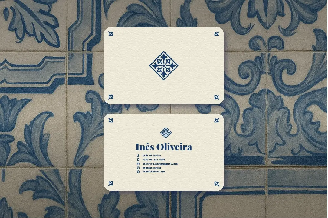
On the development-facing side, I designed the layout mobile-first to ensure scaling felt natural on any device, implementing flexible grids and card-based blocks that adapt smoothly across breakpoints. Interactive elements — hover states, carousels, and section transitions — were intentionally subtle, keeping the experience calm while still feeling polished. Every color was chosen with accessibility in mind, balancing contrast with aesthetic harmony so text remained readable against all backgrounds. Navigation remains minimal to avoid cognitive overload, while the single-page format helps guide users through a coherent narrative without friction. I also created a minimalist azulejo-inspired logo for brand consistency across the site. Overall, the project demonstrates my approach to frontend design: blending cultural references with modern UI, letting visuals and copy carry emotional weight, and building interfaces that feel easy, warm, and scrollable. Tiles included, naturally.